
Huel: Noodles Launch
AGENCY: HUEL
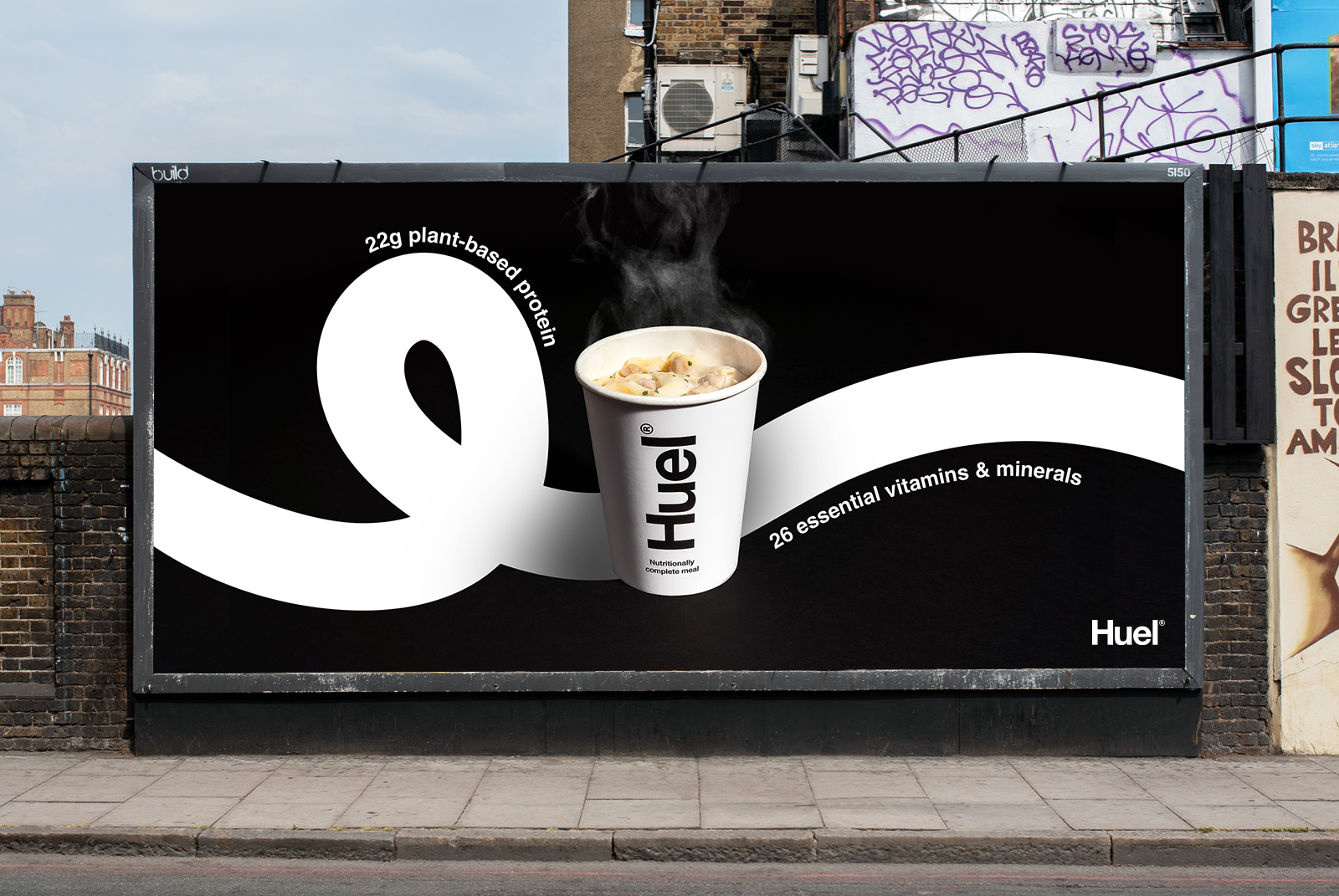
I was invited to support and inspire Huel’s internal creative team with the design direction of the launch of their new instant hot noodles. A different route was selected in the end but on this page you can find a slice of what I created during my time there. Please note - all copy used is placeholder.
I wanted to explore how far I could push Huel’s monochrome palette and Helvetica typeface by using line, pattern and shape. Due to the minimalist-style packaging, I noticed that as a consumer it was difficult to differentiate between the different flavours. The team were also keen to explore new ways of presenting each pot’s nutritional information.
Whilst focusing on 3 key flavours, I used Huel’s noodle photography to create 3 distinct patterns. The patterns could be used across multiple touch points to elevate the characteristics of each flavour. I also experimented with the form of the single noodle through illustration and how this could be implemented as a tool to highlight nutritional information across all flavours.


Gochujang

Simple short noodle shapes created using line to be used behind the product
Fettucini Alfredo

All black areas would be used as cutaway windows to reveal the product behind
Katsu

White noodle outline on black to be used behind the product


I paired pattern with playful illustration and typography to tie everything together across various mockups for digital, print and OOH touch points.


